- May 4, 2021
- --
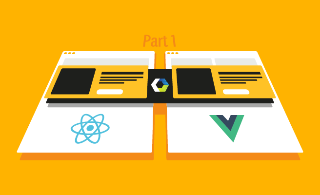
Web Components Part 1: Exploring Reusable Web Components
-
 Jorge FrancoSenior Software Engineer, Magnolia

Experience Magnolia in action
Experience Magnolia's key features firsthand in an interactive product tour.
Take a tour nowWeb development is evolving very fast and new frameworks and technologies are emerging constantly. Both developers and browsers need time to support the changes.
Web Components is a suite of different technologies helping with this challenge.
By allowing developers to create reusable custom elements, Web Components is making life easier for developers. You can use them with any JavaScript framework, and it is very simple to include them in your HTML pages.
Custom elements are supported by all major browsers. For backward compatibility it is possible to include a JavaScript library enabling their use in older browsers.
In this post I am going to explore the different technologies around Web Components using test-driven development (TDD). As an example I will create a basic custom element, that I refer to as the component. The code and commit history is available in GitHub, allowing you to easily follow my steps.
In a follow-up post I will use this component on a page to browse a real JCR workspace using a client to connect to Magnolia’s REST API.
Setup
I created a new component, a test page, and a node package configuration using npm. You can take a look at the changes in this commit.
I chose the library web-component-tester to test the component properly. It doesn’t seem very active, but it does the job well with almost zero configuration.
In this blog I will explore the three main technologies of Web Components:
- HTML templates
- Shadow DOM
- Custom elements
HTML templates
HTML templates are helpful when creating a web component’s structure.
They are defined using the <template> tag, holding a piece of HTML that can be displayed and reused on the page through JavaScript. A template can also include styles. The HTML standard does not, however, provide a mechanism to use a template across pages.
That means that when working with a template in a web component, you have to make sure that the template is defined on the page that is using the web component.
To use a template in my component, I first replaced innerHTML with an HTML template, as you can see in this commit.
This version of my template does not allow for variable substitution yet. As the versatility of these templates is not as good as in other template engine libraries such as Moustache or Handlebars, I introduced a variable as a <span> tag and then assigned it a value. To see how I’ve done it, you can check my commit.
Headless Architecture
Magnolia gives your developers the freedom to work with any front-end framework and your marketers the visual control to create great digital experiences at scale.
Learn moreShadow DOM
To improve the component’s encapsulation I used the shadow DOM API, attaching a separately-rendered Document Object Model (DOM) to it:
this.attachShadow({mode: 'open'}); By separating the component from the main HTML, the component won’t be affected by changes to the page’s style. This approach also works well for templates. Styles in the template only affect the component and not the rest of the page.
This example shows that changes in page styles don’t affect components.
Custom elements
Custom elements are the JavaScript APIs that lie the foundation for web components. They are defined using customElements. The JavaScript object HTMLElement is the object base that I am extending. It has a constructor that you can override. Just remember to call super when you’re done.
An element also has several lifecycle callbacks that get triggered at different stages in an element’s lifecycle.
I used connectedCallback, which is called when the component is attached to the DOM. disconnectedCallback is helpful if you want to free resources or close connections; and attributeChangedCallback is very interesting, because it allows you to react to changes in the element’s state.
Let’s define the element’s states as follows:
- Loading while an AJAX call is happening in the component
- Error when an AJAX call has failed, allowing the user to retry
- Ready when an AJAX call succeeded and the response is shown
Calling attributeChangedCallback to change the component’s DOM when an attribute changes is the final commit in our exploration of Web Components.
Conclusion
To create a component using the Web Components standards is a bit more complex than using an implementation like React or Polymer, but the reusability of Web Components is amazing. Once you developed a component, you can use it anywhere. You don’t have to import any JavaScript libraries or take care of the build process; it's just HTML and JavaScript code that your browser manages.
This blog covered a small introduction to Web Components and if it has piqued your interest, there are many resources available to get more information. If you want to play with my example, you can clone this GitHub repository and open the page test/browser/wct-test.html.
I also hope that you want to see the component in action and my next blog will show how I used the component in Magnolia.