- Sept. 15, 2026
- --
Accessible by design: the Magnolia Design System
-
 Marco MazzaiFrontend Developer, Magnolia
 -
 Design System Designer , Magnolia DXP


Magnolia in Aktion
Unser Expertenteam zeigt Ihnen live, was Magnolia für Sie leisten kann.
Jetzt Demo buchenAccessible by design: the Magnolia Design System
Key insights
-
Every component is designed for WCAG 2.2 AA from day one, not retrofitted later.
-
Now available: the React package is public on npm, installable in 5 minutes.
-
It's the UI foundation for the next major version of Magnolia DXP — build on it now, carry it forward.
-
A companion MCP server lets coding agents build from real components; a developer reviews every output.
Introduction
If you build custom interfaces on Magnolia DXP — a field, a dialog, a full app — the Magnolia Design System gives you a shortcut past two problems at once: building UI from scratch, and bolting on accessibility at the end. The React package is public on npm, so you can install it and start composing accessible, on-brand components this afternoon.
Let's dive into what the Design System actually is: what follows is what the Design System actually is, what it contains, and what it means for the interfaces you build on Magnolia DXP over the next few years.
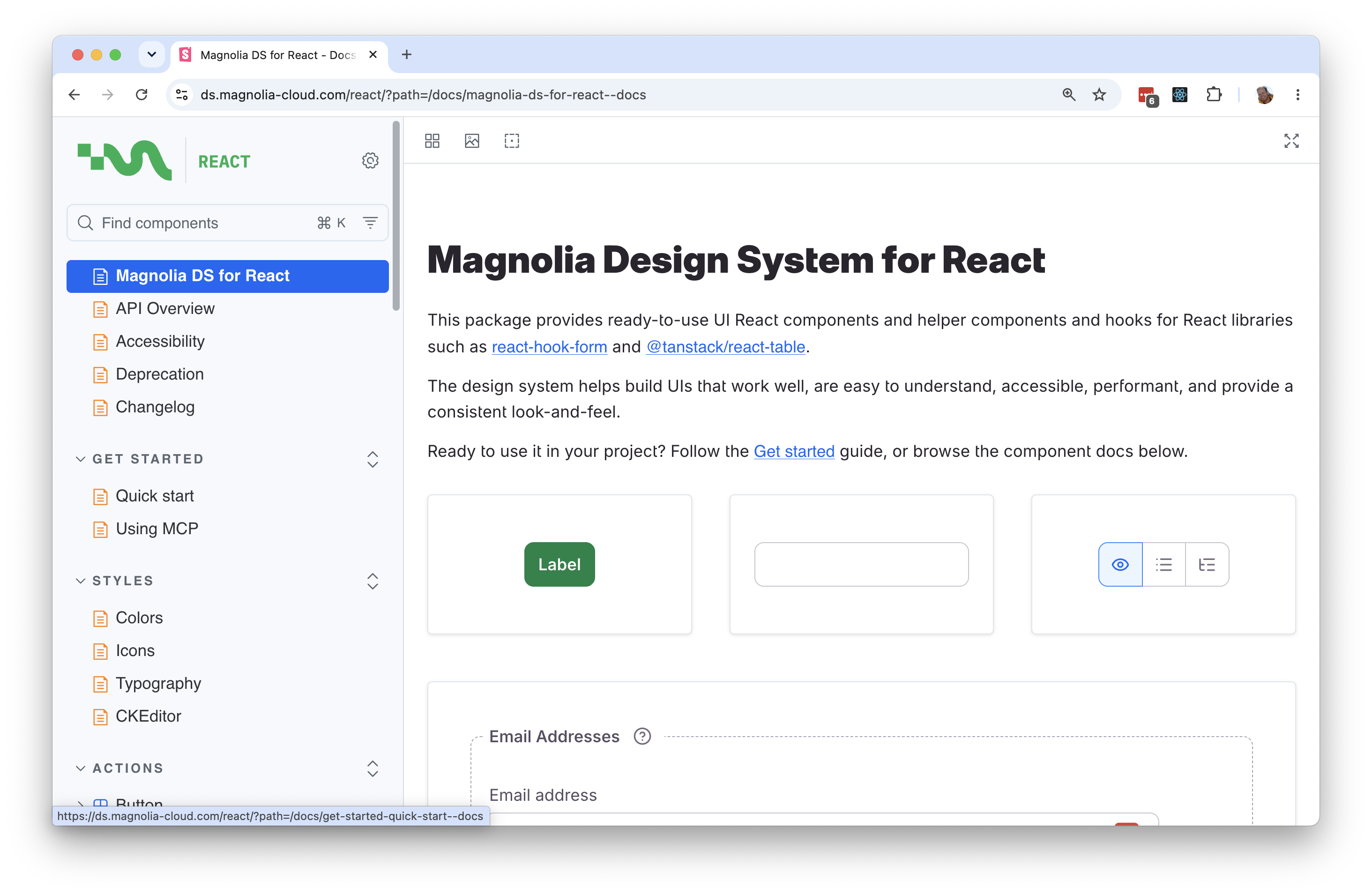
Magnolia DXP has a component library
The accessibility work was done at the component level, one component at a time, and every future Magnolia DXP interface is being built on those results.
Explore the Component LibraryAccessibility decided at the component, not at the deadline
"Every user interface decides who gets to use it."


Every user interface decides who gets to use it, says Brano, the designer who has spent the past year building the system. That is the premise the whole thing rests on.
Web technology has spent two decades getting good at interfaces that work beautifully for most people. The users left out: people navigating by keyboard rather than mouse, people who need components larger than the default, people working entirely from a screen reader's narration. Accessibility work aimed at those users is usually scheduled last, which means it is the work that gets cut when the release date moves.
The team also runs recurring accessibility audits against the Design System — conducted by Marco Mazzai, a certified Trusted Tester — to make sure those standards continue to hold as components evolve. Accessibility became a design principle considered when each component was specified, not a remediation pass afterwards. In practice that means supporting keyboard navigation for every interaction the component supports, color contrast and adjustable text sizing that hold up when the browser zooms or the base font grows, and explicit semantics so a component announces its state correctly.
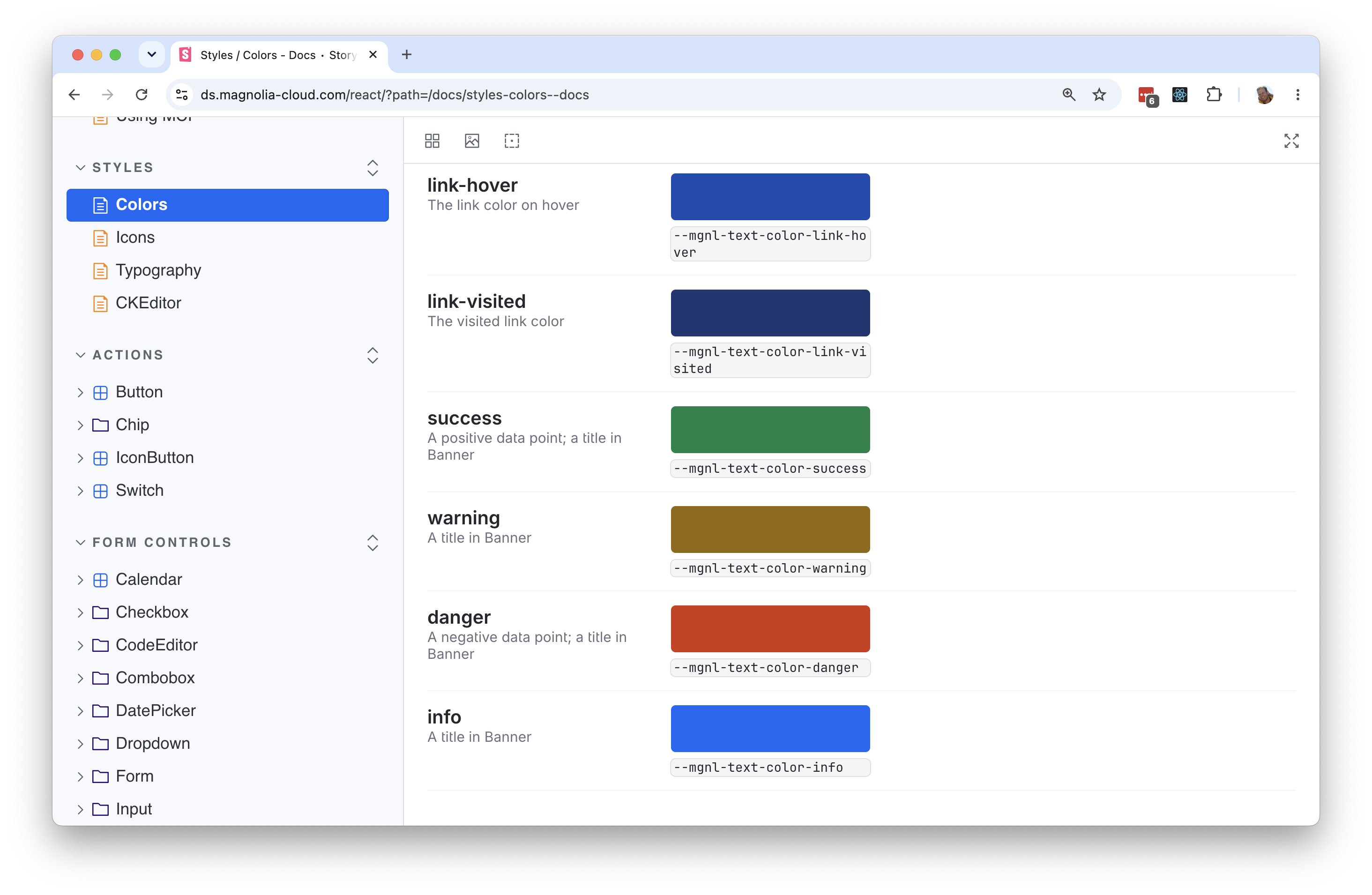
The target is Web Content Accessibility Guidelines (WCAG) 2.2 AA — a level above the WCAG 2.1 baseline most regulations currently require — as set out in Magnolia DXP's published accessibility statement. The European Accessibility Act (EAA), in force since 28 June 2025, is the reference point the team designs against, component by component.
There is a nuance worth being precise about, because Magnolia DXP has written about it before: the EAA applies to services provided to consumers. A content management interface used by professionals in the course of their work is not directly in scope. The public-facing sites your team builds with Magnolia DXP absolutely are.
Magnolia DXP is rebuilding the authoring interface to that standard anyway. Not because a regulation compels it, but because an authoring tool that a keyboard-only editor cannot operate is a tool that quietly excludes people from the profession. That decision is also what makes the system useful to you: the accessibility work is already paid for in the components you inherit.
What is actually in the package
The Design System package installs like any other dependency:
pnpm add @magnolia/mgnl-ds-react Import the stylesheet once at your entry point, add the mgnl-ds-body class to your <body>, and the components are available. React 18 and React 19 are both supported.
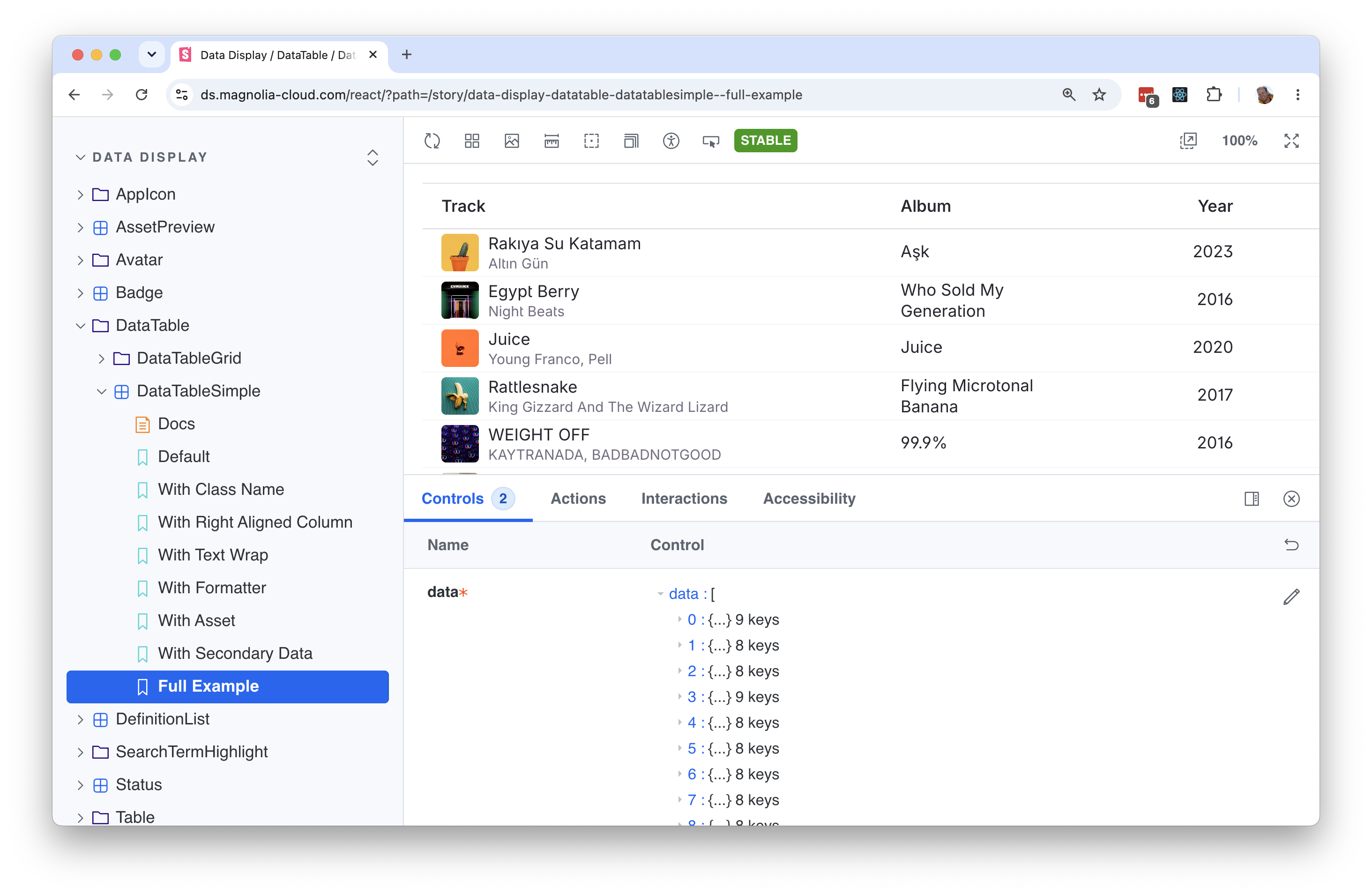
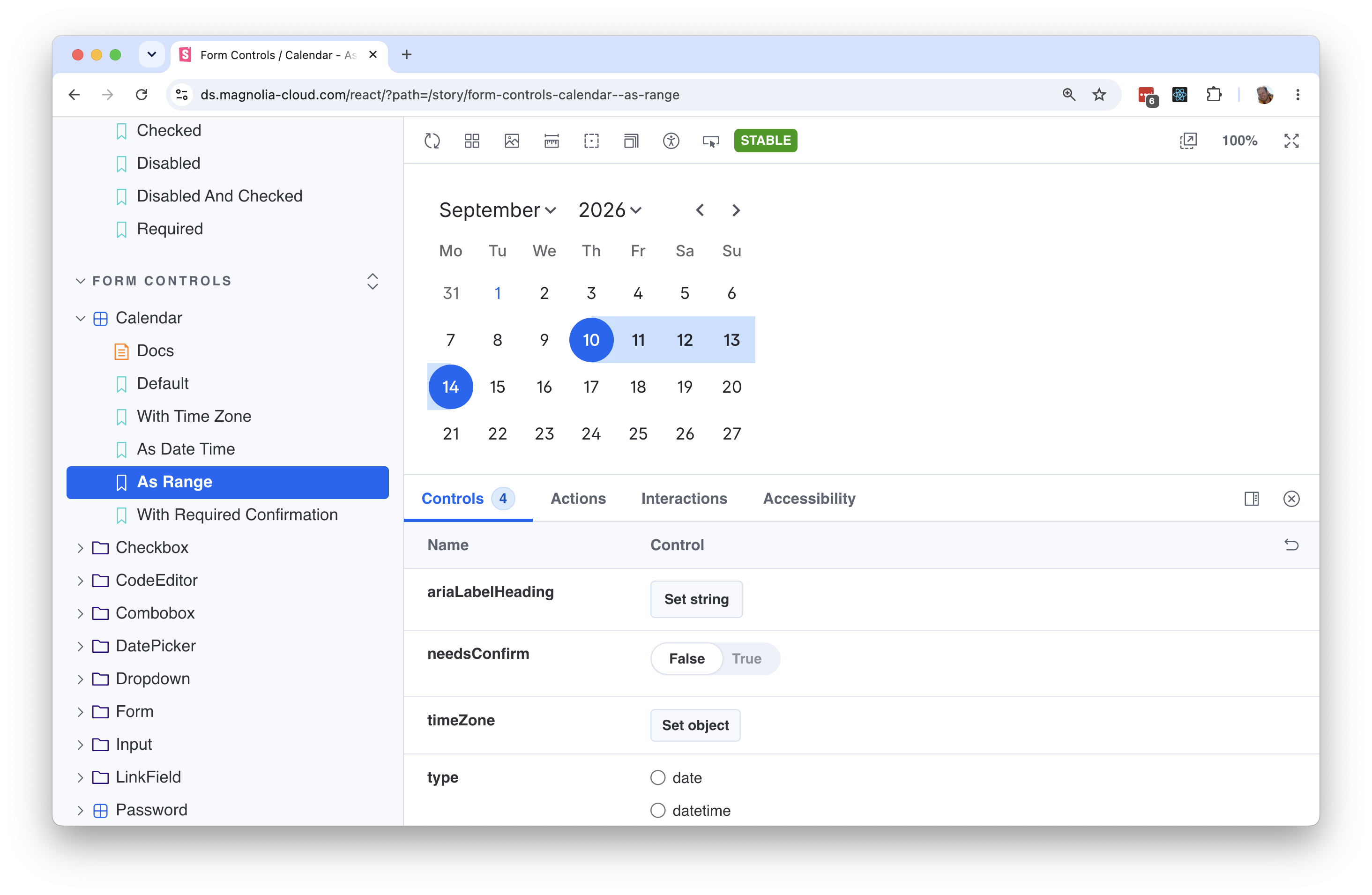
Inside are more than 65 ready-to-use React components — buttons, inputs, chips, forms, tables, navigation, dialogs, toasts, and the rest of the vocabulary an admin interface needs. The package also ships helper components and hooks for two libraries frontend teams already reach for: react-hook-form and @tanstack/react-table.
The component to look at first is the data table grid. It is the heart of most Magnolia DXP apps and, by some distance, the most sophisticated component in the system tree nesting, drag-and-drop reordering, column resizing and filtering, all at once. The accessibility work there is the part that is easy to underestimate. Reordering rows by drag-and-drop has a full keyboard equivalent — space to pick an item up, arrow keys to move it, space to drop it, escape to cancel — and every one of those state changes is announced.
If you can see the screen, hearing a screen reader narrate that sequence sounds like a lot of noise. For someone who cannot, that narration is not a supplement to the interface. It is the interface.
This is not a laboratory build. The Design System has been in internal use for over a year. In Magnolia 6.4, users can already see it in forms within content apps and in global search. In the next major release, the entire UI will be built on the new Design System: the Assets app, the Pages app, and everything else.
Where developers start
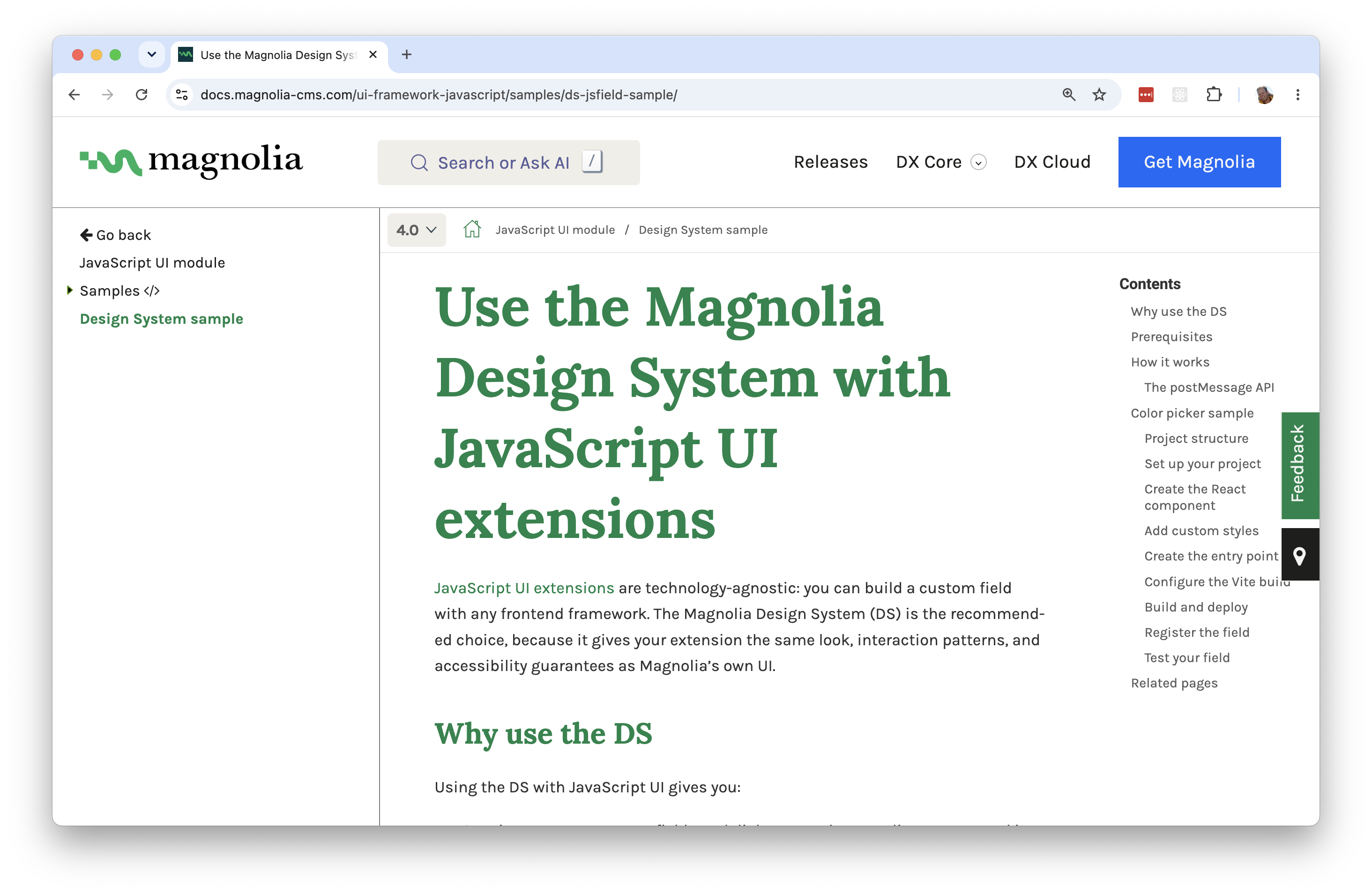
The JavaScript UI extension module is the officially supported entry point and covers the three things projects need most: custom fields, dialogs, and apps. Rather than writing custom UI code that will need rewriting later, you compose the React components from the Design System into the extension slots Magnolia DXP already exposes. A tutorial and sample project walk through a custom field built exactly that way. Note that the JavaScript UI module requires an enterprise license.
A design system that talks to coding agents
The documentation was written to be readable by people and by machines, and there is now a small piece of software that makes the second half real. @magnolia/mgnl-ds-mcp-server is a Model Context Protocol (MCP) server that runs locally via npx and exposes the Design System's Storybook documentation to a coding agent.
The practical effect: when you ask an AI coding assistant to build a Magnolia DXP interface, it can read the actual component documentation instead of guessing at an API. In a demo at Magnolia NEXT DevDay, a deliberately rough prompt — a coding agent with only this MCP server connected and a single JPEG screenshot — produced a working prototype in a few minutes, with the agent correctly inferring interactions like filtering and tree nesting that were never described to it. With precise requirements, it does considerably better.

Two things worth stating plainly. Magnolia DXP does not build, train or operate AI models — the agent and the model behind it are third-party tools you choose and connect yourself; the MCP server only serves documentation to them. And what comes back is a prototype for a developer to review, test and take through the normal review process, not code that ships itself.
There is a compounding effect here that matters more than the demo. When an agent builds on accessible primitives, the accessibility characteristics come with the components. Generated interfaces start from a much better place.
What this changes for enterprise teams
For teams selling into European public-sector and regulated markets, accessibility has moved from a nice-to-have to a line item. Government tenders in the DACH region increasingly ask direct questions about the accessibility of the authoring environment, not just the published site — and "our CMS vendor is working on it" is a weak answer when the response deadline is next month. An authoring interface rebuilt component by component against WCAG 2.2 AA is a materially better answer, and it is one that competitors cannot produce quickly, because this kind of work cannot be retrofitted at speed.
For existing customers, the practical value arrives in two stages. On Magnolia 6.x you can build extensions on the Design System now (Enterprise license required for the JavaScript UI framework, as above): you get the new look and feel in the surfaces you build, and forward compatibility with what comes next. The system comes into its own in the next major version of Magnolia DXP, which is built on it throughout.
For anyone weighing a frontend extensibility strategy, this is the argument: an extension written against the Design System today is written against the foundation of the next major version. That is a rare thing to be able to say about UI code.
Licensing, in plain terms
The Design System packages are released under the Magnolia Design System License 1.0: a worldwide, non-exclusive, royalty-free license to use them for building user interfaces for Magnolia DXP products, projects and applications — including extensions you publish on the Magnolia Marketplace. Any Magnolia DXP project can use them; you do not need an enterprise license to install the package. What the license does not permit is using the Design System in a product or service that is not Magnolia-based. It is an ecosystem-scoped license, the same pattern Atlassian and Shopify use for their design systems. (The license is included in the npm package.)
The underlying source code remains under the Magnolia Network Agreement and is available to enterprise licensees, who can browse and adapt it. The MCP server ships under Magnolia DXP's standard dual license (Magnolia Network Agreement or GPL v3, your choice).
Conclusion
The Magnolia Design System is now the shared foundation under Magnolia DXP's authoring experience, under the extensions partners and customers build, and under the next major version of the platform. It carries accessibility work that would be expensive and impractical for any single project to do alone, it is governed by a license that lets the whole ecosystem build on it, and it is documented in a way that both a developer and a coding agent can use.
That combination — an accessible foundation, open documentation, and governed extensibility — is the same thing Magnolia DXP offers at the content layer, applied to the interface layer. Speed for the people building, control for the people accountable.
Readable by people and by machines
Read it yourself or give a coding agent access to the Design System's component documentation.
Read or access the Documentation